For most people, websites mean business. Their objective is to generate leads and sales. They need to get down to business right away to grab the reader’s attention and encourage them to engage.That doesn’t mean that a business website needs to read like a spreadsheet or a brochure. In fact, it shouldn’t. Every website has room for style and function. All that said, how do you create a functional, stunning modern website design that engages your ideal customer but also works hard and conforms to inbound marketing best practices? Let's dive into some website design advice to help you do just that.
The best way to learn how to design a modern website is to take a look at some of the most prominent design elements in successful websites. Paying attention to good website design examples can help inform your website design process. Here are a few key elements of the top website designs that you should take note of.
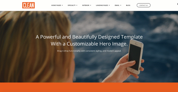
There’s no doubt that a visually stunning image will pull readers in and compel them to explore further. And when that image fills the screen (like the one above), it can work on its own or serve as a great background for overlaid text and other content elements. Large images work well in any format, too, as long as the web design is responsive to ensure a good customer experience. It is important that images scale with the screen size so the user has a good experience with it on any device or computer.
White space on a web page is another modern website design tactic. Although it’s not necessarily white, it does mean empty space. Give elements on your page room to breathe. When pages are too crowded or jammed with small visuals and lots of text boxes, it’s difficult for readers to find a focal point and you’ll lose them out of frustration. This tip is not new to magazine and newspaper publishers. For years they have used white space to accent the great content they provide. Just because there is space on the page does not mean it must be filled. I like to think about it as a conversation you have with a friend. You should always be a good listener. When you are around a person who feels the need to speak whenever it is quiet, that can be rude, so the same is true for website pages. Let the white space create calm for the reader in between the insight you share with them.
In line with lots of white space, is the thinking that colors should not predominate your site. This doesn’t mean that you shouldn’t use beautiful color photos. What you should aim for is a maximum of two to three colors introduced in the text and other graphic elements. Viewers tend to get distracted and overwhelmed if there are too many colors appearing in navigation, content, banners, etc. And when selecting colors for these elements, it’s always a good idea to stick with your brand color palette. There are many online tools that can help you choose complementary colors for your website. Adobe has a tool to help create color schemes and there are many others.
Perhaps not an obvious design component—but important to modern web design—is clearly defined navigation. When your site is careless in its directed paths, your site is sloppy and your business appears confused. But when your navigation is organized and fluid, you lead viewers on a flawless path to learning more about you and they’ll be more inclined to stay and engage. What's more, site navigation should support the visitor (or buyer's journey) for information in a logical path. We are also a fan of sticky menus that enable a visitor to easily move from page to page based on their needs in addition to navigation within each page. Hubspot has a very nice article about how to nail down the perfect website navigation.
How you display your text says a lot about you as a company. Fonts have personalities and the ones you select for your website should reflect the style and tone of the nature of your business. Typography decisions are typically made when your company’s brand is developed but if you’re working without those guidelines, be sure to select fonts that embody who you are as a business. If you’re a fashion or beauty company, you have many options that are fun and flirty, but a B2B business will want to opt for fonts that have more gravitas. Another note on choosing fonts is to make sure they’re supported by common computers and browsers. There’s nothing worse than creating a beautiful site whose words turn into illiterate scratches for some readers. By testing your website on multiple computers, operating systems, and browsers you will expose these types of issues. Any skilled web developer will steer you clear of making a font mistake.
When you're creating a website, you can't pay the bills with stunning design elements alone. You want the vibrancy that a new site will create, yet you can't ignore the fact that all components must work together to generate leads and business. So how can you go about making sure your site targets and converts your ideal customer?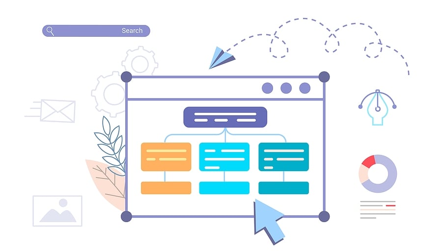
This one has a bit of style and function. You may have built the most impressive site ever known to hit the digital world, but if it doesn’t adapt to multiple viewing formats, you’ll end up with a confusing mess. People access websites from all types of screens and browsers so you’ll want to make sure that your site translates well on a mobile screen as well as it does on a laptop. Another important factor for supporting mobile devices is to make sure the technology that is running (hosting) your website is extensible to the increasing needs that search engine optimization methods impose. Responsiveness has a lot to do about the hosting platform (WordPress, Hubspot, and others) and the template that is used to create the website.
Pro Tip: Check to see if your website is responsive with this Google responsive testing tool.
Modern website design elements such as title tags, meta tags, heading tags, structured data markup, and other HTML code can improve the Search Engine Optimization (SEO) of your site and really boost your rankings in web searches. Although these elements are invisible to the eye, they are critical to creating a fully functioning site that is built for business. For example, search engines are penalizing non-responsive websites and giving websites positive visibility when they support the Google AMP format. Website SEO is one of those areas that require a really good technical resource to make sure everything has been implemented correctly on your website as well as capturing high-quality inbound links that bring visitors and increase domain authority.
Modern websites have to be beautiful, responsive, and on-brand for your business. But don’t worry. You can head into your new site creation with confidence when armed with information about some of the biggest design challenges to be faced. We’ve identified some of the biggest web design challenges for you, as well as a few ways you can address them. 
You need to give your visitors a clear path to navigate your site. Sometimes there is just too much conflicting content and visual stimuli for the reader to make a logical decision so they just abandon the page. To prevent this from happening, start the website design process with a purpose map (sometimes called a wireframe with message flow) that specifies the information flow with the accompanying information for each page. And to make things even easier, be sure to get buy-in from stakeholders before starting. This is one of the most common website design challenges for beginners. Fortunately, the solution is relatively simple, but the creation of the purpose map requires strategic thinking.
Just as you need to give visitors a clear path on your site, you must also give them clear messaging about your brand, products, and services. Don’t make your readers work to understand who you are and what your brand stands for. Develop the foundation of a positioning and content strategy that differentiates you and your products. And then stick to it. No matter how much you are tempted to throw in everything about yourself, stick to the core communications messages for clarity and efficiency. Remember, your website visitors must instantly understand what you do or what you stand for when visiting your website.
A great piece of modern website design advice is to use large, hero images to engage visitors and support a company’s brand story. Many times, stock images fit the bill perfectly and are much more budget-friendly than custom photography.
Plus, if you particularly like a stock image because it works well for your business, chances are pretty good that another company (several, actually) will also like the image and decide to use it on their site. When viewers see this image on more than one site, it erodes authenticity and trust in your company.
It’s always a good idea to rotate images periodically to minimize the risk of tired and overused stock images. One way to address this issue is as simple as using your cell phone to take pictures each day. As you build up your image library you have a differentiated set for your website. Simple image editing tools enable you to add text to images to help reinforce the point of the image on the page.
A website must adopt a style and tone that engages visitors and customers appropriately. For example, financial institutions won’t do well by using swirly fonts and bubblegum pink navigation bars, however, those elements might be perfect for a cosmetics company site. The main thing is to understand your audience and create a style that will immediately appeal to them and encourage them to engage.
Another important point is to consider the benefit of the use of "smart content" on the site that changes the content based on which buyer persona is visiting. For example, a CEO may need different content than a marketing manager or a sales representative. By personalizing the content dynamically, the visitor becomes more engaged and will have a much better perception of your brand.
In attempts to add interest and appeal, too many companies add gimmicks and style elements that just end up cluttering the space and confusing the reader. Some guidelines to keeping it simple include maintaining a consistent color theme throughout (brand colors are always appropriate), sticking to three or four colors, and limiting font choices. And resist the need for lots of navigation complexities which usually work against a good customer experience.
The best approach is to work with a designer with a keen eye for colors that fit your brand. We have learned that selecting website colors is an art form so ask for help because selecting the wrong colors may have a negative psychological impact on your brand. Here is an example of 50 website color schemes - but be sure to focus on your logo and brand colors as a starting point.
Your primary website goal is to interest people enough that they want to engage with you. So don’t make it hard for them to find you. Make sure your basic contact information is not only current but also easily accessible on your site. Too many times a company address, phone number, hours of operation, shipping policy, FAQs, and more are buried or not available at all. Encourage people to contact you and give them the means to do it easily.
Too many times, companies invest lots of money into marketing initiatives to drive people to their sites, yet they neglect to implement any method to capture the information of customers and other visitors when they get there. This loss of a potential lead or sale means that the company now has to invest even more marketing dollars to try and pull in new leads.
There’s a simple—and less costly—way of capturing all the potential sales possible by designing an opt-in offer on the home page. It can be something simple like an instant discount or access to an e-book or more elaborate such as a contest giveaway. Do what will engage your buyers, while remaining true to your brand, and don’t let another visitor slip away unnoticed and without opting into your communications.
One important and often overlooked challenge with website design is not establishing the site’s analytics through an analytics program such as Google Webmaster Tools. Too often, running a site’s analytics falls to the wayside and a company loses the opportunity to make critical changes that could dramatically improve its effectiveness. The Google webmaster tools give you a way to identify errors on your website and correct them as well as make sure the website sitemap is published properly.
Another important method of measuring how well a site is performing is by drilling down into the site data to see how visitors are engaging—or not. With integrated website analytics, you can use tools to point out pages that are not performing well, analyze conversions and also test elements such as promotions and banners. Be sure to use analytics that provide you with visibility down to the visitor level so that you can optimize the conversion paths that are working and fix conversion paths that are not.
Having the option to course correct can mean the difference between a thriving business or a floundering one. Analytics aren’t the sexy parts of a new website but they’re the guideposts to keep you from failing. So, test, measure, optimize, repeat. Your business will thank you.
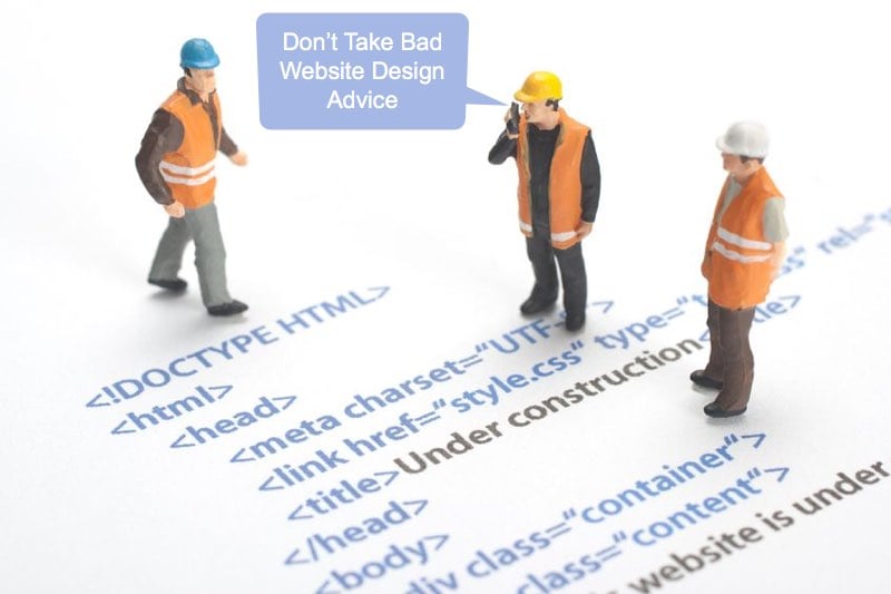
In web design, you may see popular practices online that seem to make sense. That said, much of what's trendy and popular doesn't constitute best practices for web design. In fact, it's possible that some of the worst websites of all time have used these techniques.
Since we are Inbound Marketers, we've focused our efforts on learning how to design a modern website that looks great and functions well for your ideal customer. So when we criticize common website design advice and practices, it is because they often do not help to produce a positive ROI for your business in the way of leads and sales opportunities.
Here are some common website practices that are simply wrong when it comes to the design of a high-quality inbound marketing site.
One bad piece of advice that informs most of the worst website design on the internet is to simply overload the site with flashy javascript-driven animation features and other low-value content that does not contribute to communicating your message or positioning effectively.
One of the biggest problems with unnecessary features is that anyone with a slow computer or internet connection will have a poor experience on your website. Even those with the highest speed machines can be confused and disoriented by too much "bling" on a landing page or website page. To further expand on the issue of website speed, search engines like Google are now penalizing sites that are slow to load, impair the user experience, or don't create engagement.
A much better approach is to keep the pages visually appealing to the reader, and let the content speak for itself. In general, it's much better to design a subtle website than it is to overload pages with animations and ads versus delivering value to the reader.
In the same vein, some web designers don't pay enough attention to the text on the site as long as the pages are visually appealing. The visual appeal does make a difference, but that doesn't mean you should slack off when it comes to writing engaging website content.
In fact, time and time again, companies find that grammar or spelling issues on a page lead to loss of credibility for their business. The majority of web readers are informed enough to spot poorly written text -- and many of them will notice it instantly. Their perception of the website (and the business) will decrease, and they're likely to look elsewhere for credible, authoritative information.
When we work on how to design a website for a client, we always tell them that despite their (and our) best efforts, through the implementation process we are looking at the pages so often that we will miss common mistakes. To err is human, after all. We ask each client to identify one or more people, especially those who are good copywriters, to review every page. A great copywriter will always find errors. It is worth the time and effort to review multiple times before the website launches.
So maybe you have clean text on the website. That's great! But what's the intention behind it? Too many websites take a direct overselling approach. They shout about the branding of the company and make dramatic claims about a product or service. There is nothing worse than turning off prospects by overselling.
Instead of this kind of empty content strategy, build each page to tell a story educationally. Think about what your ideal customer will want to learn, and structure pages accordingly. Your business is better than your competition because of facts about your product, the way you help clients, or other differentiating details. Educate the visitor about these facts in a positive way and help them create a positive vision of your company in their mind's eye. Companies realize that by investing in authoritative thought leadership, they're building an audience in an organic way, not with a high-pressure approach.
Another piece of bad advice for websites revolves around the history of the internet and how things have changed very quickly in recent years.
Back in the '90s and even into the last decade, keyword stuffing was a commonly applied approach. Google algorithms used to rank sites according to keyword placement, and as a result, aggressive webmasters were jamming keywords in everywhere they would fit, in meta-titles, tags, and on-page copy. It made a lot of websites look downright strange since they were written for machines, not humans.
Google doesn't rank pages by just keywords; they rank them based on how well they satisfy the search intent of the visitor. Google and other search engines have built elaborate algorithms that notice and reward good quality content, not text that’s inundated with keywords. That is why planning your website pages based on the way a visitor would want to learn about your company makes the most sense.
Additionally, when crafting high-quality content for blogs and premium offers that address your visitors' problems, it is best to begin with a content strategy that is designed to appeal to your ideal buyer. The right content will organically rank with search engines and attract your best prospects without keyword stuffing techniques. When someone conducts a search and clicks on your link, they should find content that answers their question or meets their needs. This reinforces the point that you should never write content just to rank for a keyword and that those efforts without satisfying the needs of the searcher will be detected by search engines and fail.
On a closing note, it's important to realize that your website doesn't exist in a vacuum. Instead of just following what everybody else is doing on the web, think of it as one channel in a multi-channel world. Think of web design in context, and things like responsive mobile design and inbound marketing best practices will inform how you build a landing page and every other page of the site to attract, convert, close, and delight customers. Your extra effort will pay off as people navigate to your site and have a quality experience like you wish to represent your company brand.  If you have recently experienced bad website design advice, don't wait to seek help. Today’s websites have many caveats for perfection when it comes to appeal and usability. Combining beauty and functionality demands savvy designers who appreciate the art of business with the chops to make it all come together behind the scenes while also enabling and supporting inbound marketing to help your business grow.
For more website design tips from Bristol Strategy, download the 25 Website ‘Must Haves’ eBook.