As a business owner, you know you need a good website to attract visitors and get them to buy from you. You research products yourself and casually surf. You can see that the look of your site plays a big role in how prospects respond to it.
But you’re not a designer or a developer. How can you spot the right modern website design, the one that will create the online space that businesses dream of? You want a website that is eye-catching and easy to use. Picking out the specifics that get you the buzz you want can be confusing.
Part of the confusion is that design trends come and go. The web evolves quickly, and changes are rapid. Design follows technology, and vice versa.

The time for short pages is over. Visitors prefer long, single pages that tell the entire story about a product or event. It’s a natural outgrowth of mobile devices with touchscreens and better resolution on all types of screens, including desktops and laptops.
Keeping your story on one page gives the reader a smoother, more coherent user experience. Consider a traditional newspaper. How often do you avoid flipping from page 1 to page 8 to finish a story? But don’t you love it when the entire article is all on one page? It’s the same with webpages. By placing content on a single page, you make less likely your visitors will miss important details.
Long pages can be intimidating if not done right. With the evolving standards of modern website design 2017, graphics, animations, videos, and surprising uses of type and space let people scan and stay interested, clear to the end of the page.
Looking for ideas? Digital Telepathy explored the many facets of long pages here.
Bonus Offer: Download your free copy of te eBook: 30 Greatest Lead Generation Tips, Tricks and Ideas
Again? You probably thought this was over and done with after Google’s Mobilegeddon. Not so. True, websites now must have a mobile presence. But how friendly is it? Just because visitors can access your site via a mobile device doesn’t mean they’ll stick around.
The best mobile sites have a modern website page design that is clean and easy to navigate, even on a smartphone screen. This can take the form of lots of white space or lots of colors. The key element is a clean layout. These sites have buttons that are designed with fingers in mind. Tapping to navigate is simple, not clumsy. Designmodo showcases 50 great designs here.
Accelerated Mobile Pages (AMPs) are an important and new method for delivering pages that are specifically optimized for mobile devices. The AMP project originated from Google and Twitter and has now become a standard approach for improving the experience for mobile viewers. You can think of AMP pages as mobile pages on a diet. Search engines are now giving AMP pages priority in search results versus traditional HTML pages. We include this information here because it is a mobile specific requirement for mobile web pages, especially blog pages. MOZ has a detailed description of AMP in one of their whiteboard Friday sessions here.
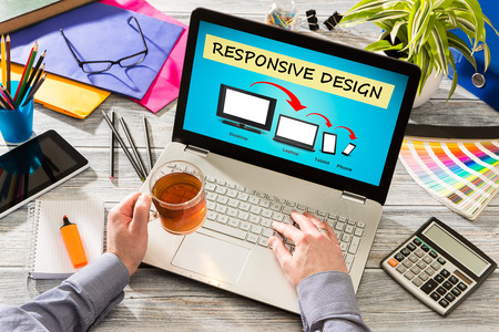
One big website design trend is the switch to layouts that are creative and complex. Tools like Flexbox and CSS grid are making this possible. They allow for greater design possibilities, while still creating fully responsive sites.
Wondering what they look like? Check out Grid by Example and this Visual Guide to CSS3 Flexbox Properties. These references are pretty technical, but rest assured that most modern website design companies understand and apply these techniques.
Gamers love virtual reality, and that’s one of the reasons it has becoming so popular as part of modern website design in 2017. Leading edge designers are working hard to incorporate VR and 360 video into their sites.
A new movie is making use of VR, the recent Blair Witch movie, which gives viewers an interactive experience with 360 web. For the biggest impact, the makers suggest using a VR headset and watching it on your mobile.
Although VR images are an exciting new option for website images, the ability to render the images on multiple browsers is still a work in process. Wondering what it’s all about? Google has a website that explains Google VR here.
Of course, 360 video notwithstanding, video in many forms (explainer, animation, describer, and more) should be an integral part of any modern website design.
People’s attention spans keep getting shorter. So designers are using action to hold their attention. Cinemagraphs are high-end GIFs or micro-videos on a loop. The visual interest they provide helps static pages pop out. When well made, not cheesy, they add sparkle and interest to a website experience. You can see a variety of them here.
Scalable vector graphics, better known as SVGs, uses advanced web technology to effectively scale the graphics so they look crisp and pleasing on any screen or device. SVGs are versatile, work great in animations, and are reliably accessible. Here’s what they look like on CreativeBloq.
Bold typography in a layout can grab the eye, without causing confusion. That’s a big attraction for designers who want visibility without clutter. People are used to memes, featuring bold type over a fitting graphic. Designers have taken that and run with it, using type for impact. Awwwards has some impressive examples.
Designers know that visitors find modular design reassuring. They can easily find what they are looking for, as well as be entertained. Layouts using the modular concept give a website a clean look that is inviting, not intimidating. Some of the modular designs can be pretty far out there, however, if you are looking to create a modern website design that differentiates your brand and you want to take a bit of a risk then you may want to consider it. Take a look at the beautiful and interesting examples at Line25.
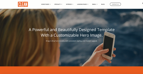
As a practical matter, people click through to landing pages far more often than they do to your home page. It makes sense to spend design energies there. This is the page that convinces people to sign up, download or buy. Wondering what a good landing page looks like? Hubspot put together a collection of 20 of the best.
The most important point about landing pages is you must consider the visitor and how much information they will need in order to convert on the landing page for the offer. It is especially important if the call to action on the landing page is a purchase for a service or a product. We like to think about the "buyer's journey" for information when designing these pages. When looking at the Hubspot examples pay special attention to how each bit of information is presented at each portion of the landing page when viewing from top to bottom.

Great graphics, bold colors and easy navigation are nice. But the whole point is turning your visitors into buyers. Smart website owners and designers in 2017 aren’t waiting for that to happen haphazardly. They take control of the process, which is called the Buyer’s Journey.
Using the system of the Buyer’s Journey means gently taking your visitor by the hand as he goes through the stages that lead to a sale. The three steps are:
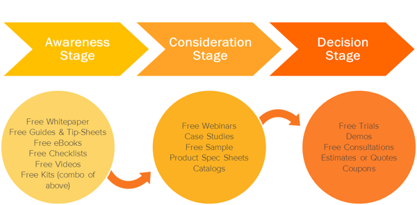
A well designed website incorporates these stages, which influence the choice of graphics and content, where elements are positioned on the page and how text is worded. Approaching the journey the way your buyer does, you can choose the right categories for your page and descriptions and answer their potential pros and cons. You can make sure the information and layout resonates with their expectations.
The result of efficient use of the Buyer’s Journey is more sales. Want to know more? Hubspot Sales has an overview here.
SEO, search engine optimization, has long been key to making sales with a website. But you can go even further. The best websites, and the most lucrative, use the precepts of inbound marketing to optimize the entire visitor experience, tracking them and turning them into customers and fans.
Getting found in the search engines, the point of SEO, is still a pillar for your website. If people can’t find you, they can’t buy from you. But that’s just the start.
By following the principles of inbound marketing, you can attract visitors using your blog, the right keywords and social media. When they visit your site, you can turn them into leads with your contact forms, calls-to-action and landing page content.
Once they become a lead for your sales team, you can work to close the sale via email and the use of your CRM tools. When you do it right, your customers then become fans and spread the word. That’s the ideal sales process in 2017. Bristol Strategy has a thorough explanation here.

The best content perfectly answers the questions and solves the problems of each visitor. And that’s tough to do. But modern technology is making it easier. The process isn’t perfected, but it’s getting more common in 2017.
The aim of personalization is to provide specific visitors with content suitable for their characteristics. This fits in neatly with the Buyer’s Journey and inbound marketing.
Right now, the viewer needs to go through a personalization process manually. You can allow them to customize their viewing experience by letting them follow certain topics and content creators, choose what feeds they get, as well as share and bookmark your site.
Modern marketing automation and website hosting technology keeps getting more robust and now enables automatic personalization of website pages. You can now customize every page on your website for each buyer persona or other parameters. As a result, the visitor is more likely to believe that your business as focused on them which generates affinity for your brand. Marketing leaders should consider implementing personalization in 2017 to stay ahead of modern website design trends.
Technology keeps getting more complex. And that influences every part of the modern website design process. But reassuringly, the basics never change: whatever the new trends are, you are still trying to attract visitors, then turn them into buyers. Using new tools, the latest design best practices and quality content is how you do it. If you would like to learn how Bristol Strategy approaches website design, then please read the article A New and Modern Website Design Journey.
Bristol Strategy is a full funnel inbound marketing agency and inbound sales agency offering the full complement of Inbound Marketing services that enable our clients to surpass their business objectives by transforming the way they engage with their buyer on-line. Reach out to us to learn more about how our experience and capabilities can help your business grow.